
Above-the-Fold Design: What Really Needs to Go There?
27 February 2026 by Mike Rose
“Above the fold” is one of those phrases that refuses to disappear. Some argue it belongs to a bygone era of fixed desktop screens and rigid layouts, insisting that modern users scroll instinctively, almost reflexively, making the concept redundant. On the surface, that argument feels plausible. After all, scrolling is second nature.
And yet, first impressions still happen in an instant.
The space visible before a user scrolls remains the most scrutinised real estate on your website. It shapes perception before logic has time to intervene. Within seconds, visitors are asking themselves – consciously or not – whether they are in the right place, whether this brand understands their needs, and whether it is worth investing further attention. If the answers are unclear, they leave. Not angrily, not dramatically. They simply click away.
Above-the-fold design is not about preventing scrolling. It is about earning it.
Understanding Modern User Behaviour
Today’s users do scroll, but they do so selectively. Digital behaviour is characterised by scanning, filtering, and rapid judgement. Attention is finite, and cognitive load is real. When someone lands on a webpage, they are not reading line by line; they are assessing structure, hierarchy, and clarity at speed.
This is where user experience, or UX, becomes more than a design buzzword. The layout, typography, imagery, and messaging above the fold collectively determine whether the page feels intuitive or overwhelming. A cluttered interface increases friction. A vague headline introduces uncertainty. Too many competing calls to action create hesitation.
Clarity, by contrast, reduces mental effort. When visitors can immediately grasp what a business offers and who it is for, the decision to continue becomes almost effortless. The above-the-fold section acts as an orientation point, anchoring the user before they explore further.
In a digital environment saturated with choice, that moment of orientation is critical.
The Core Purpose of Above-the-Fold Design
Above-the-fold design is not meant to tell your entire story. It is not the place for exhaustive explanations or dense paragraphs of brand history. Its purpose is far more strategic – to provide immediate clarity and direction.
At a minimum, this space should answer four fundamental questions. Who are you? What do you offer? Who is it for? And what should I do next?
These questions may appear simplistic, but they are powerful. If a visitor cannot quickly articulate the value proposition of your business, the problem lies not with their attention span, but with your messaging. A strong, benefit-led headline that communicates outcomes rather than features sets the tone. A concise supporting statement adds context, reinforcing relevance. Together, they establish positioning within seconds.
Just as importantly, above-the-fold design should signal the next step. Whether that is exploring services, booking a consultation, or learning more, the primary call to action must be visible and intuitive. Users should not have to search for direction; it should be presented confidently and clearly.
This is not about being aggressive. It is about being intentional.
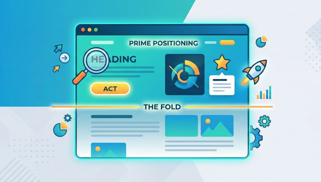
What Really Deserves Prime Positioning
Given the strategic weight of this space, what genuinely belongs there?
First and foremost, a clear value proposition. Too many websites open with vague statements about “innovative solutions” or “passionate teams”. While well intentioned, such phrases lack specificity. They fail to differentiate. A compelling headline, by contrast, speaks directly to a need or ambition, painting a picture of the outcome your audience desires.
Supporting copy plays a crucial role, adding nuance without overwhelming the reader. It should expand the headline’s promise just enough to deepen understanding, while remaining concise. Brevity, here, is strength.
Visual reinforcement is equally important. Imagery, video, or subtle design elements should complement the message rather than distract from it. A well-chosen image can contextualise an offer instantly, grounding abstract concepts in something tangible. However, aesthetics must never eclipse clarity. A visually striking hero section that obscures the core message is a liability, not an asset.
Credibility indicators also have a place above the fold, particularly in competitive sectors. This might include client logos, industry accreditations, or succinct testimonials. Used sparingly, these elements provide reassurance without cluttering the layout. They whisper authority rather than shouting it.
Ultimately, prime positioning should be reserved for what drives understanding and confidence. Everything else can follow.
Common Mistakes in Above-the-Fold Design
Despite its importance, above-the-fold design is often mishandled. One frequent error is overcrowding. In an attempt to communicate everything at once, businesses cram multiple messages, links, and visuals into a single viewport. The result is noise. When everything is prioritised, nothing is.
Another mistake is prioritising aesthetic trends over strategic clarity. Minimalism can be powerful, but when taken to extremes it can become ambiguous. Likewise, bold typography and animated elements may capture attention, yet if they distract from the core message they undermine performance.
Vague headlines are particularly damaging. A beautifully designed page that fails to articulate what the business actually does leaves users confused. Confusion is costly.
There is also the issue of misplaced calls to action. Hiding the primary next step below the fold, in the hope that users will naturally discover it, assumes patience that many simply do not have. Direction should be obvious, not buried.
Above-the-fold design is not an artistic playground. It is a strategic tool.
Strategic Alignment: Design With Intent
Effective above-the-fold design cannot exist in isolation. It must align with broader brand positioning, messaging strategy, and conversion rate optimisation objectives. The headline should reflect the language used in advertising campaigns. The visual style should echo the brand’s identity. The call to action should connect seamlessly with the user journey beyond the homepage.
This alignment ensures coherence. When messaging is consistent across touchpoints, trust deepens. When design and strategy operate in harmony, friction reduces.
It is also important to recognise that above-the-fold priorities may vary depending on business model and audience. A service-based consultancy will require a different emphasis than an e-commerce retailer. The common thread, however, remains clarity of purpose.
Design without intent is decoration. Design with intent is performance.
Designing for Impact, Not Decoration
Above-the-fold design continues to matter, not because scrolling has disappeared, but because attention is scarce. The first screen a user encounters shapes perception, influences trust, and determines whether curiosity turns into engagement.
What truly belongs there is not determined by trends or personal preference. It is determined by strategy – by what your audience needs to understand immediately in order to feel confident moving forward.
If your website’s first impression lacks clarity, cohesion, or direction, it may be quietly costing you conversions. Social Loop’s website design services focus on creating strategically structured, high-performing websites where every element – especially above the fold – serves a purpose. By combining thoughtful UX, compelling messaging, and conversion-led design, we ensure your digital presence does more than look good. It works.
And in a competitive digital landscape, that distinction makes all the difference.