Designing High-Converting Contact Pages: Essentials Most Businesses Miss
15 September 2025 by admin
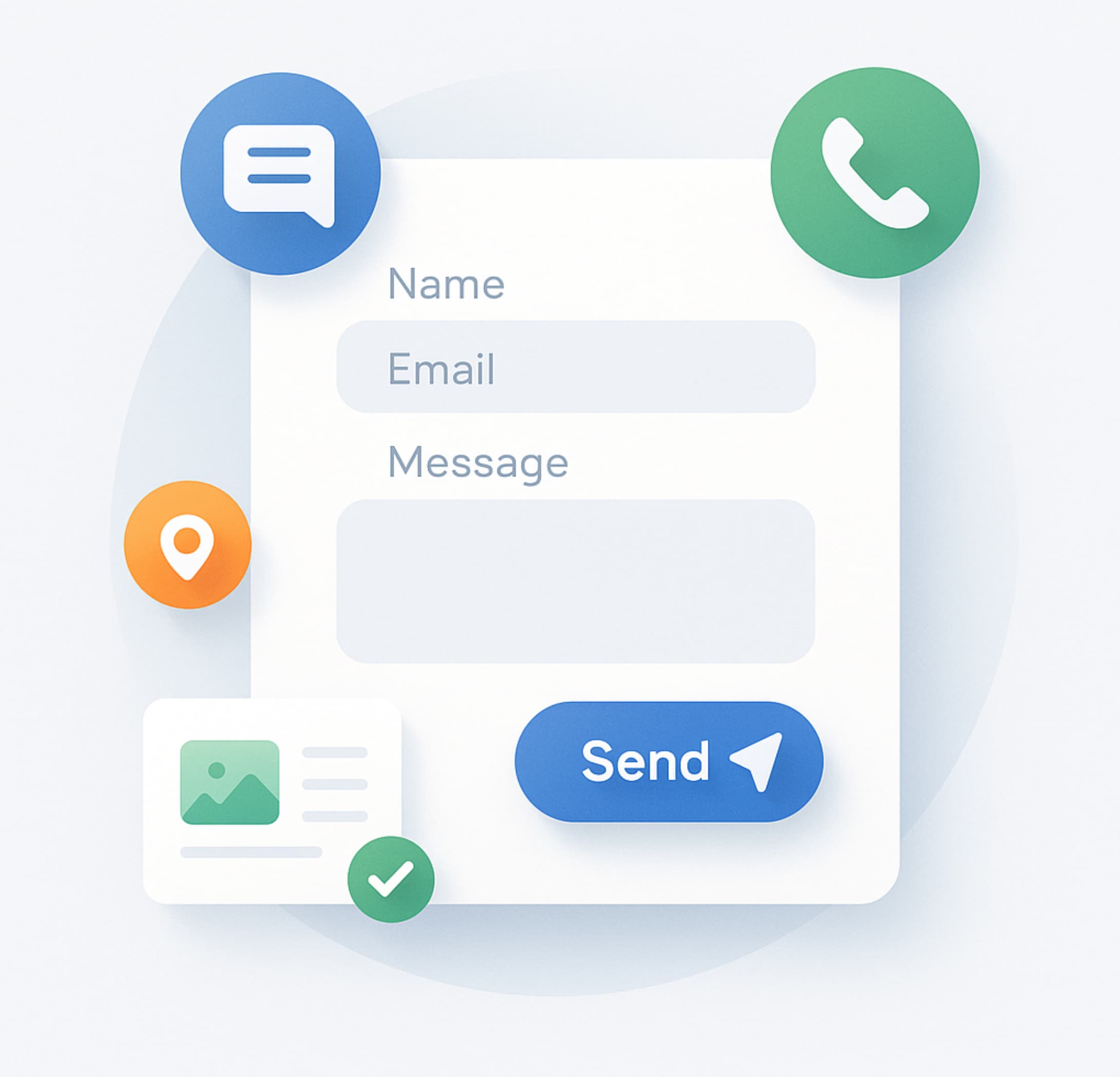
For many brands, the contact page is treated like a polite afterthought – a necessary link in the footer, a form with a tired “Submit” button, and not much else. It’s a missed opportunity. Your contact page sits at a critical junction in the journey, where curiosity becomes intent and intent becomes conversation. Design it with clarity, care and credibility, and you’ll see the lift in both enquiry volume and lead quality.
Below, we’ll set out what a contact page must accomplish, the mistakes that quietly repel would-be enquirers, and the elements that turn a dead-end into a conversion asset.
What a contact page must accomplish
A high-performing contact page has four jobs:
- Clarity – say who should contact you, for what, and how. If you serve different audiences, make it obvious which route suits whom.
- Choice – provide the right channels without turning the page into a switchboard. Form, email, phone, chat or WhatsApp – choose deliberately.
- Confidence – set expectations on response times, show how data is used, and include trust cues that reduce anxiety.
- Continuity – ensure the page matches the promise made upstream. If ads or product pages offer a consultation within 24 hours, your contact page should echo that commitment.
Common mistakes that repel enquiries
Plenty of contact pages fail not because of what they include, but what they ignore:
- Vague or buried details. Hiding email and phone behind a form feels evasive. If you offer them, show them.
- Bloated forms. Requiring job titles, budgets and postcodes before a human reply is earned signals effort without value.
- Hostile hurdles. Aggressive CAPTCHAs, fussy file-type limits, forced account creation – each one adds friction.
- No expectation-setting. “We’ll be in touch” is not a service level. State when – and how – you’ll reply.
- Lack of trust signals. No privacy notice, no accreditation, no testimonials – nothing that answers “Is this safe and credible?”
- Poor mobile ergonomics. Tiny tap targets, weak contrast, slow loads – death by a thousand micro-frictions.
Elements of a high-converting contact page
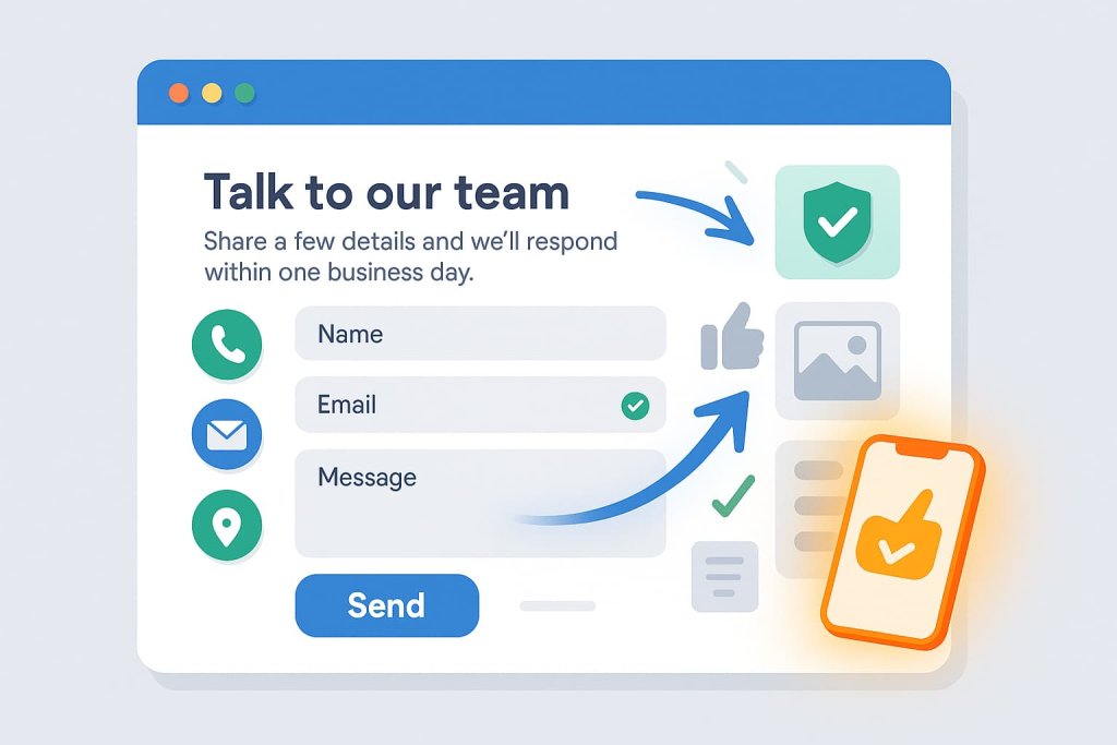
1) Headline and purpose line
Open with a clear headline – “Talk to our team” – followed by a short purpose line: who this page is for and what happens next. Example: “Share a few details and we’ll respond within one business day.”
2) Right-sized channel options
Offer a focused set of paths: a concise form for most enquiries, plus an email link and phone for urgent matters. If location matters, include an address and lightweight map. Add chat only if it’s genuinely staffed.
3) Form UX that respects time
Ask only what you need to route and respond well. Mark required vs optional fields, enable browser auto-fill, and use inline, plain-English validation – “Please add a valid email so we can reply.” For addresses, use postcode lookup. Long forms? Add a simple progress cue.
4) Microcopy that reduces anxiety
State response SLAs, opening hours, and how data is handled: “We’ll reply within 24 hours – we won’t share your details.” If you triage leads, say so politely. Clarity builds trust; trust unlocks action.
5) Trust and compliance
Include a concise privacy notice and GDPR/PECR-compliant consent where relevant. Security badges or accreditation logos can help – keep them discreet and genuine. One short testimonial or a row of well-known client logos is plenty.
6) Accessibility and inclusivity
Use descriptive labels, high contrast, and readable font sizes. Ensure full keyboard navigation and sensible focus states. Provide a non-phone alternative for those who cannot call. Write in clear, inclusive language.
7) Mobile-first layout
Design for thumbs: large buttons, ample spacing, sticky primary CTA, and numeric keypads for phone/postcode fields. Keep load light – compress assets, defer non-essential scripts, and avoid heavy pop-ups.
8) Anti-spam without pain
Prefer honeypot fields, rate limiting and server-side checks over hostile CAPTCHAs. If a CAPTCHA is unavoidable, choose the least intrusive version.
Design for intent – route and respond intelligently
Not all enquiries are created equal. Map your top intents – sales, support, press, careers, partnerships – and guide people to the right destination. Simple routing via a dropdown or separate CTAs reduces back-and-forth, speeds responses, and improves satisfaction.
Provide self-serve links where appropriate: FAQs, help centre articles, pricing pages and documentation. You’ll deflect low-value queries kindly while keeping the door open for higher-intent conversations.
Finally, tailor the thank-you state. Confirm receipt, restate the SLA, and offer a relevant next step – a scheduling link for sales, a tracking portal for support, or a resource pack for partners. The moment after submission is prime real estate for reassurance.
Measurement, testing, iteration
Treat your contact page like any other conversion surface:
- KPIs: form starts vs completions, field-level abandon, error rate, mobile vs desktop delta, time to first response, qualified lead ratio.
- Tools: granular event tracking, form analytics, heatmaps, session replays, inbox tagging to classify outcomes.
- A/B ideas: fewer fields vs more, button copy (e.g., “Send enquiry” vs “Submit”), SLA phrasing, placement of phone/email, inclusion of a single testimonial, presence of chat.
Establish a monthly review rhythm. Fix small UX debts quickly, keep copy and SLAs accurate, and retire anything that adds friction without adding value.
Implementation checklist
- One-sentence purpose line and clear SLA.
- Minimal fields, inline validation, auto-fill, postcode lookup.
- Accessible labels, high contrast, large tap targets.
- Visible alternate channels (email/phone) where offered.
- Concise privacy notice and compliant consent.
- Lightweight social proof near the form.
- Smart routing for sales/support/press/careers.
- Friendly thank-you page with next steps and helpful links.
- Tracking for starts, completions, errors and response times.
- Anti-spam via honeypot/rate limiting; avoid hostile CAPTCHAs.
Treat your contact page as a conversion page
When a prospect reaches your contact page, they’ve already done a portion of the work – reading, comparing, deciding whether you’re credible. Don’t make them fight the interface. Reduce effort, increase certainty, and speak plainly about what happens next. The result is predictable: more enquiries, better enquiries, and faster paths to qualified conversations.
If you’d like persuasive microcopy, intent-led messaging and a page that turns interest into action, Social Loop can help. Our website design services pair strategic UX writing with clear information design – building contact pages that convert with confidence. Get in touch, and let’s turn your most-overlooked page into a dependable source of high-quality leads.