Designing Service Pages That Actually Generate Enquiries
15 April 2026 by Mike Rose
There is no shortage of well-designed service pages online. They look polished, often visually impressive, sometimes even premium. And yet, many of them quietly fail at the one thing they are supposed to do – generate enquiries.
The issue is rarely effort. It is misalignment. Too many service pages are built as digital brochures, focused on describing what a business does rather than persuading a visitor to take action. They list features, outline offerings, and occasionally sprinkle in some generic selling points, but they lack direction. There is no clear journey, no strategic progression, no sense that the page has been designed with a specific outcome in mind.
A high-performing service page is not just informative. It is intentional. It guides, reassures, and ultimately nudges the user towards making contact. That shift – from passive information to active conversion – is where most businesses fall short.
Understanding What Users Are Really Looking For
When someone lands on a service page, they are not browsing casually. In most cases, they have a problem, a requirement, or at the very least a growing interest. They are evaluating options, comparing providers, and quietly asking themselves a series of questions. Can this business help me? Do they understand my situation? Can I trust them?
This mindset is crucial. It means your service page is not just a place to explain your offering, it is a place to answer unspoken questions. If the page fails to do that quickly and convincingly, the visitor will move on, often without hesitation.
Designing for this intent requires empathy as much as strategy. It means stepping outside of internal language, industry assumptions, and business-centric thinking, and instead focusing on how the user interprets what they see. Clarity, reassurance, and relevance become far more important than technical detail or brand-centric messaging.
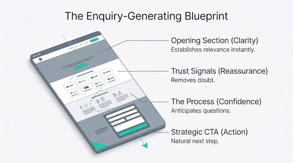
The Critical Role of the Opening Section
First impressions on a service page are not formed gradually. They happen almost instantly. Within seconds, a visitor decides whether the page feels relevant, understandable, and worth their time.
This makes the opening section disproportionately important. It needs to communicate what the service is, who it is for, and what outcome it delivers, all without forcing the user to think too hard. Overly clever headlines, vague language, or abstract messaging can feel creative internally, but they often create confusion externally.
Clarity is not boring. It is persuasive. A well-written opening section anchors the user, giving them confidence that they are in the right place. It reduces friction immediately, which in turn increases the likelihood that they will continue reading.
In many ways, this is where the enquiry journey truly begins.
Structuring the Page to Guide, Not Overwhelm
A strong service page does not just present information. It leads the user through it. The structure should feel intuitive, almost invisible, guiding the visitor from initial interest to informed confidence without forcing them to search for meaning.
This progression typically moves from a clear introduction into deeper explanation, then into benefits, process, and supporting trust signals. Each section should build on the last, gradually removing doubt and reinforcing the value of the service.
When structure is neglected, even good content can feel disjointed. Users are left piecing together information themselves, which creates unnecessary effort. And effort, even in small amounts, introduces friction.
The most effective service pages feel cohesive. They anticipate what the user needs to know next, answering questions before they are consciously asked. This is not accidental. It is the result of deliberate design and thoughtful sequencing.
Persuasive Copy Without the Noise
There is a fine line between persuasive and overwhelming. Many service pages cross it without realising, attempting to include every possible detail in the hope that more information will equal more trust.
In reality, the opposite is often true.
Effective service page copy is selective. It focuses on what matters most to the user, highlighting benefits rather than simply listing features, and explaining outcomes in a way that feels tangible and relevant. It also acknowledges potential concerns, addressing them with clarity rather than avoiding them entirely.
This does not mean stripping back to the point of vagueness. It means writing with intent. Every sentence should serve a purpose, whether that is to inform, reassure, or persuade. When copy becomes bloated, its impact weakens. When it is focused, it becomes far more powerful.
Trust Is the Deciding Factor
Even if a service page is clear and well-structured, it will struggle to generate enquiries without trust. This is often the silent barrier between interest and action.
Trust is built through both content and design. Testimonials, credentials, and transparent explanations of process all play a role, but so does the overall feel of the page. Consistency, professionalism, and attention to detail signal credibility in ways that users may not consciously recognise, but still respond to.
There is also an element of emotional reassurance at play. Users want to feel that they are making a safe decision. They want to believe that the business understands their needs and will deliver on its promises.
A service page that actively builds trust removes hesitation. It makes the decision to enquire feel less like a risk and more like a logical next step.
Calls to Action That Feel Natural
A surprising number of service pages treat calls to action as an afterthought. They are either too vague, too hidden, or too disconnected from the rest of the content.
A strong call to action should feel like a natural continuation of the page. By the time a user reaches it, they should already understand the value of the service and feel confident in the business. The CTA simply provides the next step.
Clarity is essential here. Generic phrases can feel impersonal and uninspiring, whereas more specific, user-focused language can make the action feel more relevant and approachable. Placement matters as well. A single CTA buried at the bottom of the page is rarely enough. Strategic repetition, without becoming intrusive, helps ensure the opportunity to enquire is always within reach.
Reducing Friction Where It Matters Most
Even when a service page successfully builds interest and trust, small points of friction can still prevent enquiries. These are often overlooked, but they have a disproportionate impact on conversion rates.
Long or complicated forms, unclear navigation, slow loading times, and poor mobile usability can all disrupt the user journey at the final moment. The intent is there, but the path to action feels inconvenient.
Reducing this friction requires attention to detail. The enquiry process should feel simple, quick, and intuitive. The easier it is to take action, the more likely users are to follow through.
In many ways, this is where design and conversion optimisation intersect most clearly. It is not just about how the page looks, but how it functions under real-world conditions.
Turning Service Pages Into Enquiry-Generating Assets
Service pages have far more potential than many businesses realise. When designed strategically, they become one of the most powerful tools for generating leads, building trust, and driving growth.
The difference lies in intent. Pages that are built to inform will do exactly that – inform. Pages that are built to guide, reassure, and convert will generate enquiries.
This requires a shift in perspective. From aesthetics to outcomes. From internal messaging to user understanding. From static content to structured journeys.
If your service pages look the part but are not delivering results, it may not be a traffic issue. It may be a design and messaging issue.
Social Loop’s website design services focus on creating high-converting service pages that combine clarity, structure, and persuasive content. If you want your website to generate more enquiries, not just impressions, it may be time to rethink how your service pages are designed.