Why Too Many Choices Hurt Conversions (And How Design Can Fix It)
15 December 2025 by Mike Rose
There’s a familiar moment many websites create without realising it. You land on the homepage, scan the navigation, clock half a dozen calls to action competing for attention, and feel a subtle sense of friction. Nothing is wrong, exactly. There’s just too much going on. Too many options, too many routes forward, too many decisions being demanded before you’ve even worked out whether you trust the brand.
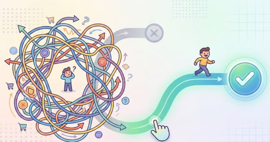
This is the paradox at the heart of modern digital marketing. In trying to be helpful, comprehensive and inclusive, many websites end up doing the opposite. They overwhelm. And when users feel overwhelmed, conversions quietly slip away.
The well-intentioned trap of “more”
Most websites don’t start out cluttered. Complexity tends to creep in over time, fuelled by growth, internal pressures and a perfectly understandable desire to showcase everything a business offers. A new service is added, a new audience identified, a new campaign launched, and each addition earns its own place on the site. Eventually, every page is carrying the weight of multiple priorities.
The problem is that users don’t experience websites in neat organisational charts. They arrive with limited attention, limited patience and a very human need for reassurance. When faced with too many choices at once, the brain doesn’t calmly weigh each option. It hesitates. It questions. It looks for an exit.
This isn’t a reflection of intelligence or intent. It’s cognitive load in action.
Why choice feels exhausting online
Choice overload isn’t a theoretical concept reserved for psychology textbooks. It’s something everyone recognises instinctively. The more decisions you’re asked to make, the harder each one becomes. Online, this effect is amplified by speed. Users are scanning rather than reading, making snap judgements based on layout, hierarchy and tone before they’ve consciously processed the content.
When a page presents too many equally weighted options, it forces users to do the work your design should have done for them. Which button matters most? Where should their attention go next? What happens if they choose the “wrong” thing?
That uncertainty creates friction, and friction kills momentum. Instead of moving forward, users pause. They scroll aimlessly. They open a new tab. Often, they leave entirely, not because the offering is weak, but because the path feels unclear.
The quiet cost to conversions
From a conversion perspective, too much choice rarely announces itself as a problem. You don’t see an error message or a sudden crash in performance. What you see instead is a gradual erosion of effectiveness. Bounce rates creep up. Key calls to action underperform. Engagement spreads thinly across multiple pages without building towards a decisive action.
This happens because choice dilutes focus. When everything is presented as important, nothing truly stands out. Primary conversion goals end up competing with secondary ones, and users are left without a strong sense of direction. The result is hesitation, and hesitation is the enemy of conversion.
Crucially, this isn’t about hiding information or restricting access. It’s about timing and prioritisation. Asking users to make too many decisions too early undermines confidence, especially for those who are still orientating themselves.
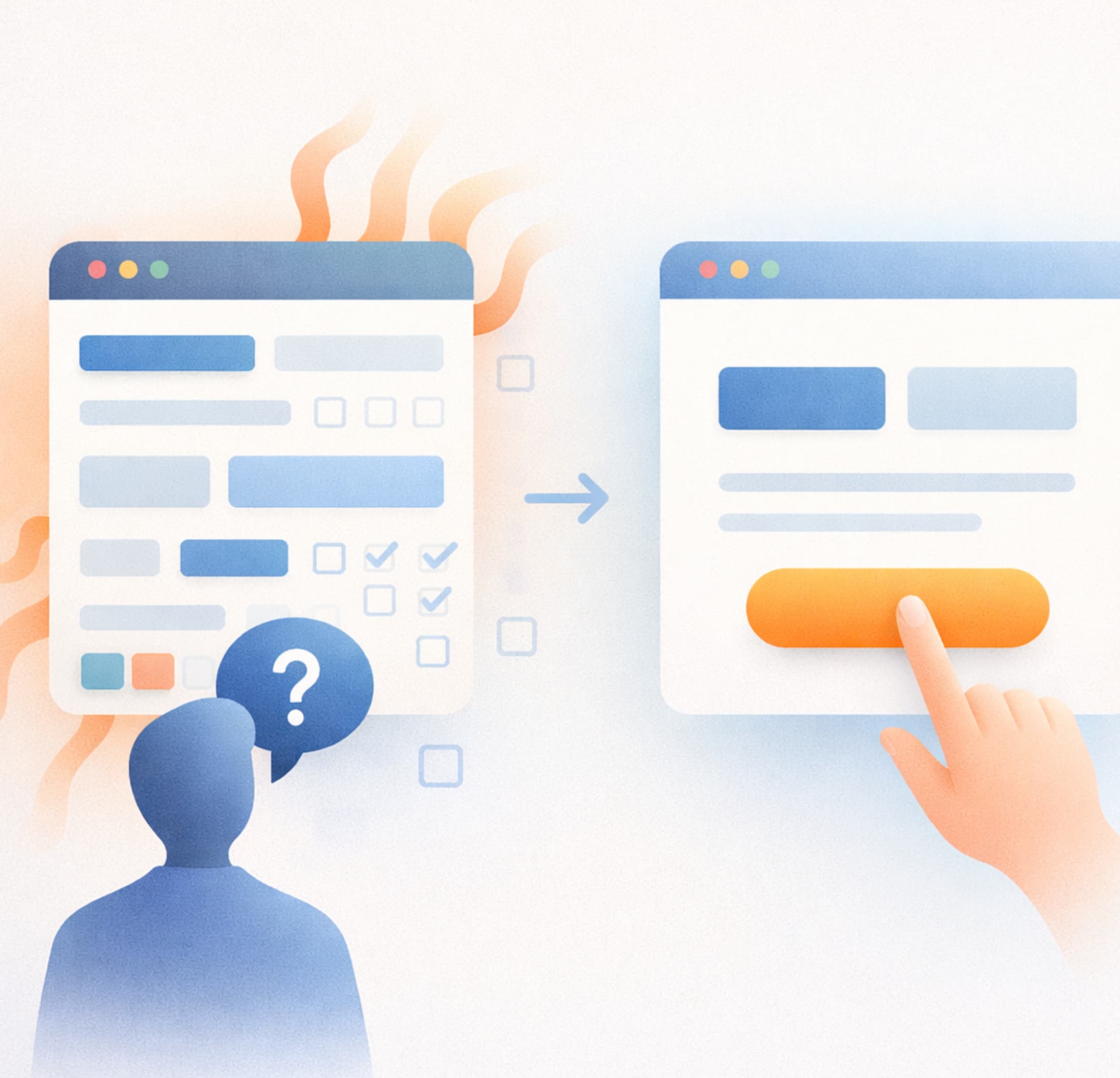
Design as decision architecture
This is where good design earns its keep. Not as surface-level aesthetics, but as a form of decision architecture. Effective design anticipates user behaviour, reduces unnecessary thinking and gently guides attention towards what matters most.
Strong visual hierarchy is central to this. Through spacing, typography, contrast and layout, design can signal importance without saying a word. A clear primary call to action, supported rather than crowded by secondary options, gives users a sense of safety. It tells them, quietly but confidently, this is the next step.
Equally important is what’s removed. Design that converts well is often defined more by what it excludes than what it includes. Fewer navigation items, more focused messaging and cleaner page structures all reduce cognitive load. Instead of forcing users to evaluate everything, the site does the heavy lifting for them.
Clarity beats comprehensiveness
One of the most persistent myths in digital marketing is that more information builds more trust. In reality, clarity builds trust. Users don’t need to see every service, feature or capability immediately. They need to understand, quickly, whether they’re in the right place and what to do next.
This is particularly relevant for service-led businesses, where internal teams often feel every offering deserves equal prominence. From a user’s perspective, though, relevance is contextual. What matters on first contact is reassurance and direction, not completeness.
Well-designed websites respect this. They layer information, revealing depth as confidence grows, rather than confronting users with everything at once. This approach doesn’t simplify the business itself, it simplifies the experience of engaging with it.
The commercial case for restraint
There’s a tendency to treat design decisions as subjective, almost decorative. In practice, they are deeply commercial. Every additional choice on a page is a small tax on attention, and those taxes add up quickly.
Restraint, then, becomes a competitive advantage. Brands that guide rather than bombard, that focus rather than sprawl, create experiences that feel calm, intentional and trustworthy. In a crowded digital landscape, that sense of ease can be the difference between interest and action.
It also signals confidence. Choosing what not to highlight implies clarity of purpose, and users are remarkably good at picking up on that. A site that knows where it’s going makes it easier for others to follow.
Fixing the problem at the source
If your website feels busy, unfocused or strangely hard to navigate, it’s rarely a content problem alone. It’s a design problem rooted in competing priorities and a lack of clear decision-making. Fixing it isn’t about adding new features or louder messaging. It’s about stepping back and asking harder questions about intent, hierarchy and user behaviour.
At Social Loop, we approach website design with this exact challenge in mind. Our focus is on creating sites that convert not by shouting louder, but by thinking more clearly, stripping back the unnecessary, and designing journeys that feel intuitive rather than demanding. If you suspect your website is asking users to make too many choices, and paying the price for it, we’d be happy to help you rethink it.
Because sometimes, the most powerful way to increase conversions isn’t to offer more, it’s to offer less, more deliberately.